Kingfish: An Homage to Tim Moore
Peter Reginato
113 × 121 × 62 inches
Photography not permitted
Lent by The Metropolitan Museum of Art, Purchase, Lila Acheson Wallace Gift, 1987
1987.226
GPS: 30.29017, -97.73850
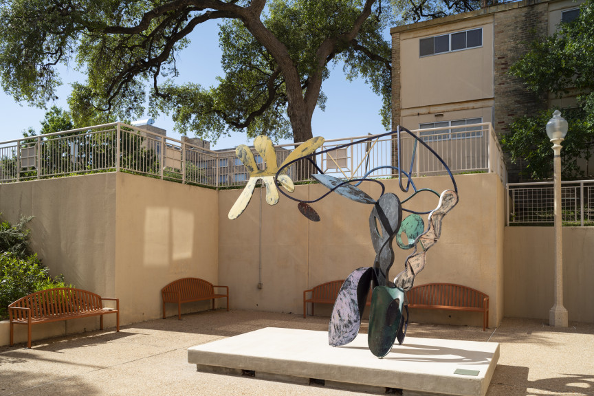
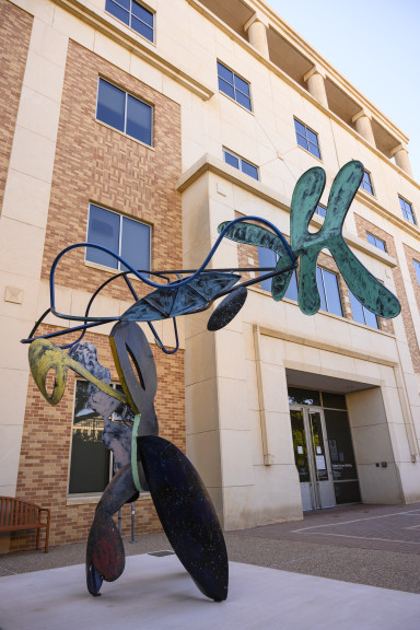
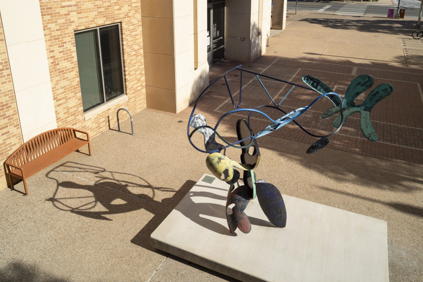
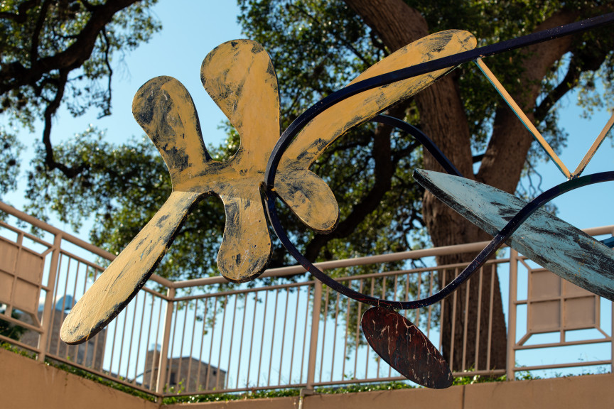
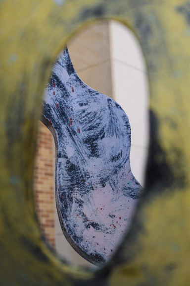
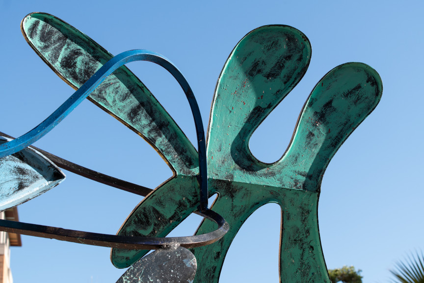
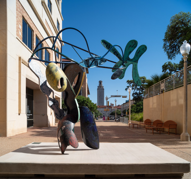
In the late 1960s, when the modernist aesthetic of geometric abstraction dominated sculpture, Peter Reginato found such rigid shapes impersonal and lacking individuality. Instead, he embraced the dynamic energy of organic forms, drawing inspiration from artists like Alexander Calder (1898–1976), Julio González (1876–1942), Pablo Picasso (1881–1973), and David Smith (1906–1965). Reginato began by sketching fluid shapes on sheet metal, which he cut with a blowtorch and joined with spot welds. These combined pieces appeared to float in a delicate, rhythmic dance. His goal was to translate the spontaneity of drawing into three dimensions: “I like to think that all my rippling, swelling forms could easily be flying wildly in space.” His bold use of color further animated these lively forms.
Lowery Stokes Sims, the curator who acquired Reginato’s work for the Metropolitan Museum of Art, noted, “Peter Reginato defied the modernist strictures of truth to materials and form by using color and sensuous, biomorphic shapes, even evoking content.” She compared his approach to the work of artists of color who forged art reflecting identity and cultural nuance, and to women who elevated craft and domestic arts in the context of fine art. By distancing himself from both Minimalism and Pop Art, Reginato created works full of vitality with uplifting spirit. As he once remarked, “Essentially, my work is joyous.”
The title Kingfish pays tribute to Tim Moore, an actor and comedian best known for portraying George “Kingfish” Stevens on the controversial television show Amos ‘n’ Andy (1951–53). Moore, one of the first African American television celebrities, had a long career in vaudeville and radio. However, Amos ‘n’ Andy was criticized for its racist caricatures, leading to its cancellation after protests from the NAACP. In 2019, Reginato added the subtitle An Homage to Tim Moore to acknowledge the complexities surrounding Moore’s role and the show’s legacy. The sculpture invites reflection on America’s history of racial representation and the evolving interpretations of cultural artifacts, offering a nuanced lens on these entanglements.
ACTIVITY GUIDES

Kingfish: An Homage to Tim Moore
Peter Reginato
Subject: Color
Activity: Mixing colors
Materials: Brush, paper, primary paint colors
Vocabulary: artist, color, primary colors, sculpture, secondary colors, shade
Remind your child that we see colors in all the things around us. Then explain that colors can convey mood; they can be pretty and cheerful or serious and quiet. Artists can use many different colors or different shades of one color to convey different feelings. This artist used bright colors to make his sculpture energetic
What colors do you see in this sculpture?
Which colors are light and which are dark?
Which colors move toward you and which move away?
Can you think of words to describe the colors?
Do the colors in this sculpture make you feel happy or sad? Why?
Note how light colors seem to come toward you and darker colors seem to move away. Also, the brightness or darkness of a color can convey mood.
Ask the child to make three separate paintings: one red, one blue, and one yellow. Then on new sheets, mix red and blue to make purple, yellow and red to make orange, and yellow and blue to make green. Explain that the first three drawings are primary colors and the second three drawings are secondary colors.
Artist - someone who makes things, such as paintings and sculptures
Color - lightness or darkness of a surface, also known as hue
Primary colors - red, yellow, and blue
Sculpture - a work of art that has height, width, and depth
Secondary colors - green, orange, and purple
Shade - a darkened area, in which sunlight is blocked

Kingfish: An Homage to Tim Moore
Peter Reginato
Subject: Energy
Activity: Create an energetic composition
Materials: Construction paper, scissors, and tape or glue
Vocabulary: Abstract, asymmetry, depict, dynamic, geometric
Peter Reginato is a sculptor from Dallas. He wants his sculptures to convey a feeling, as opposed to looking realistic. When artists do not want their art to look realistic, we call their work abstract. Artists can use many different colors to convey a variety of feelings. Reginato used bright colors, dynamic shapes, and asymmetry to make his sculpture light, fun, and energetic.
Can you name some colors that we associate with certain feelings?
Can you name some shapes that we associate with certain feelings?
What do you look like when you are full of energy? What shapes and colors might depict this?
What about when you are tired or resting? How would that be depicted abstractly?
On colored construction paper, draw a variety of shapes. Use both simple geometric shapes and more complicated shapes that you make up. Cut them out, and on a separate sheet of paper, try arranging the shapes in different ways. How can you arrange them so that they look restful? How about energetic or moving? Which colors or shapes are better for each feeling? When you have a composition you like, use tape or glue to secure the shapes to the page.
Asymmetry —Not having balanced or even parts, the opposite of symmetrical
Abstract —Expressing a quality apart from the way an object appears to the eye; the opposite of realistic
Depict —To represent by a picture
Dynamic —Characterized by action, the opposite of static
Geometric —Using simple shapes and elements such as lines, circles, squares, and triangles

Kingfish: An Homage to Tim Moore
Peter Reginato
Subject: Geometric Abstraction
Activity: Expressing personality through shape and color
Materials: Paint and paper
Vocabulary: Abstract, Geometric Abstraction, biomorphic, dynamic
Peter Reginato is a sculptor working in a style called Geometric Abstraction but he focuses on softening the contours of hard lines to create biomorphic shapes. His goal is to represent experiences and emotions through boldly colored geometric forms, rather than depicting them realistically. The artist used a variety of vibrant colors and dynamic shapes to give this sculpture personality and make it visually interesting.
Does this sculpture look like a person to you?
What characteristics of a person might this sculpture represent? What colors or shapes correspond to specific attributes?
If this sculpture was not brightly colored, how would its mood and personality be affected?
Choose a person that is a role model to you. Make a list of the actions and character traits that you associate with this person. Next, choose a color and shape to represent each of these attributes. Using paint on paper, make a composition that combines these colors and shapes to depict the personality of the person you chose without depicting them realistically.
Abstract -- expressing a quality apart from the way an object appears to the eye; the opposite of realistic
Geometric Abstraction -- a style of art that uses geometric shapes to create a composition that is not representational or realistic
Dynamic -- characterized by action, the opposite of static
Organic/Biomorphic forms – resembling the forms of living organisms
MORE INFORMATION
Carmean, E. A., Jr., “Peter Reginato.” Arts Magazine 52 (June 1978): 26.
Firestone, Evan R. “Three Musicians at the Harlequin’s Carnival: Peter Reginato’s New Sculpture.” Arts Magazine 59 (February 1985): 116–19.
Frackman, Noel. “Peter Reginato.” Arts Magazine 52 (January 1978): 5.
Ratcliff, Carter. “Reginato’s Improvisations.” Art in America 77 (December 1989): 146–51.
Sheffield, Margaret. “Peter Reginato: Struggling Between the Planes.” Sculpture 21 (May 2002): 18–19.
The Metropolitan Museum of Art in New York generously loaned twenty-eight modern and contemporary sculptures to Landmarks for display throughout the Austin campus. The collection represents a broad array of artists working in the second half of the twentieth century. The initial sculptures were installed throughout the main campus in September 2008, and a second, smaller group were unveiled at the renovated Bass Concert Hall in January 2009.
Funding for the loan was provided by the Office of the President. This project was the result of a collaborative effort among many, including:
Leadership
Andrée Bober and Landmarks
Pat Clubb and University Operations
Douglas Dempster and the College of Fine Arts
Landmarks Advisory Committee
William Powers and the Office of the President
David Rea and the Office of Campus Planning
Bill Throop and Project Management and Construction Services
Gary Tinterow and the Metropolitan Museum of Art
Samuel Wilson and the Faculty Building Advisory Committee
Project Team
Chuck Agro, transportation, Metropolitan Museum of Art
Andrée Bober, curator and director, Landmarks
Caitlin Corrigan, registrar, Metropolitan Museum of Art
Cynthia Iavarone, collections manager, Metropolitan Museum of Art
Cliff Koeninger, architect
Ricardo Puemape, Project Management and Construction Services
Kendra Roth, conservator, Metropolitan Museum of Art
Patrick Sheehy, installation services
Nicole Vlado, project manager, Landmarks
Special Thanks
Valerie Fletcher, curatorial contributor
Beth Palazzolo, administrative coordination, University Operations
Russell Pinkston, composer
What’s Past Is Prologue: Inaugurating Landmarks with the Metropolitan Sculptures
With the arrival of twenty-eight modern sculptures on long-term loan from New York’s Metropolitan Museum of Art, the Landmarks program has begun. Their installation throughout the Austin campus offers a remarkable opportunity to survey some of the major trends in art during the second half of the twentieth century. These sculptures allow us to witness the distinctly modern dialogue between representation and abstraction, as well as the contest between natural and industrial materials. Most of all, we can celebrate their presence as an unprecedented chance to experience works of art first-hand––to appreciate their forms and to understand the underlying ideas.
The Landmarks program perpetuates in Austin one of civilization’s oldest and most enduring traditions: the placing of art in public areas, accessible to nearly everyone and expressive of collectively held ideas. More than five thousand years ago, the cultures of Egypt and Mesopotamia produced sculptures for urban plazas, government buildings, and places of worship to express political, secular, and religious values. Grand monuments endorsed the ruling elite and commemorated military victories, while images of deities symbolized spiritual beliefs. The original purposes of public art were primarily ideological and didactic, but what has endured through the ages is the physical beauty of the art. In modern times the contexts and goals for public art have changed considerably. In many parts of the world democracy and egalitarianism have supplanted absolute rulers, and explicit religious power has yielded to secular humanism. During the mid-to-late twentieth century (the era when the Metropolitan’s sculptures were created), globalization has redefined the entire world. Societies in Europe and the Americas have became so diverse that cultural authorities can no longer be sure of which systems of meaning and which values, let alone which individuals, should be honored in the traditional ways of public art.
A schism has developed between traditionalists and modernists. In a rapidly changing world those who wanted to preserve the familiar in art have continued to commission representational statues. Modernists, on the other hand, have embraced change and gladly jettisoned the old ways in favor of abstraction. The schism is exemplified by two famous memorials in Washington, D.C., both intended to commemorate the heroic sacrifices of American armed forces. The Marine Corps Memorial (1954) consists of a superbly realistic representation of soldiers struggling to raise the American flag on Iwo Jima in 1945. In contrast, the Vietnam Memorial (1982) consists of a massive V-shaped wedge of polished black stone inscribed with What’s Past Is Prologue: Inaugurating Landmarks with the Metropolitan Sculptures July 2008 the names of the dead. At the time it was inaugurated, this monument shocked nearly everyone outside the art world and outraged many of those it intended to commemorate. In response, a group of bronze figures of soldiers was added. But soon, precisely because of its universal form and absence of imagery, the original memorial became a powerful place where all Americans could go to grieve, remember, and pay homage. To most of the art world, this demonstrated beyond a doubt the viability of abstract sculpture for public places.
With America’s increasing wealth and social consciousness in the 1960s many towns began to institute programs of commissioning sculptures for public places. By requiring that 1 or 2 percent of each building’s construction budget be used for art, urban planners sought to improve the living and working environment for millions of people. The main difficulty was agreeing on what kind of art was visually pleasing and, just as important, potentially meaningful to the general public. Two highly publicized examples were the huge, abstract, metal sculptures by Pablo Picasso and Alexander Calder, in Chicago and Grand Rapids respectively, which at first provoked derision but gradually became a source of community identity and pride.
One way to approach works of art is to consider the historical context in which they were created. During the first half of the twentieth century, life and art underwent radical transformations. Industrial manufacturing supplanted agriculture as the dominant mode of production, people migrated from rural areas to urban centers, women and minorities gained equal rights, warfare expanded to an unprecedented global scale, and technology accelerated the pace of life—and art changed in tandem.
Abstraction
Early in the modern era, many artists believed that a new visual language was needed to replace the Greco-Roman classical figurative traditions that had persisted through two millennia. Photography had made mimesis (accurate depiction of reality) unnecessary in painting and sculpture for the first time in history. Artists were free to conceive radically new approaches, and so abstraction was born, emerging from 1910 to 1920 in Europe. Initially artists simplified and stylized observed reality into organic and angular forms. That first phase soon evolved into making “pure” abstractions with no recognizable sources. From the outset, abstract art carried implicit meanings recognized by artists and informed viewers but largely lost on the general public.
Early abstractionists intended their art to convey their commitment to an ongoing transformation of society. Like Morse code in telegraphy and other new modes of communication fundamentally different from the traditional written word, abstract forms in art could convey meanings—not narrative or literal ones but broad ideas that could speak to an international audience and help advance human consciousness.
During the 1920s and 1930s, artists developed two broad types of abstraction: geometric and biomorphic. Geometry denotes mathematics and suggests such related disciplines as architecture, design, engineering, and logic as well as intangible qualities like analytical thinking and precision—desirable attributes for a rational, communal society. Artists devised a new language of geometry in art: horizontal and vertical elements can convey calm, harmony, and stability (see Harmonious Triad by Beverly Pepper), while rising diagonals can suggest energy and optimism (see Column of Peace by Antoine Pevsner and Square Tilt by Joel Perlman).
In contrast to geometric abstraction, a number of artists favored softer forms and curving contours. Inspired by sources in nature, biomorphic abstractions evoke natural phenomena, biological processes, growth, and ambiguity (see Big Indian Mountain by Raoul Hague, Source by Hans Hokanson, and Untitled [Seven Mountains] by Ursula von Rydingsvard). Such works stand in general opposition to the industrial and technological aspects of modern life; they remind us of the fundamental importance of the natural world. Biomorphism was invented and advocated by the surrealists, who believed in the importance of the unconscious mind in creating and understanding modern art. Relying on the Freudian concept of free association, such artists expect viewers to generate their own unique responses to abstract art.
The two types of abstraction began as competing and opposing philosophies, but by the 1950s many artists expertly combined them to suit their expressive needs (see the rhythmic contours of Veduggio Glimpse by Anthony Caro and the disconcerting, hulking forms of Catacombs and Guardian by Seymour Lipton).
By the 1960s, the original philosophical meanings underlying abstraction had mostly faded away, leaving “formalist” aesthetics: the creation and appreciation of pure nonreferential beauty. Formalism dominated much artistic practice from the 1950s through the 1970s, particularly in the United States in the circle around the critic Clement Greenberg. Geometric sculptures became ubiquitous in public places—some complex and sophisticated and some merely competent. A group known as the minimalists advocated an intellectually rigorous, austerely reductivist approach (see Amaryllis by Tony Smith). Other artists went in the opposite direction, toward complexity and a decorative verve (see Kingfish by Peter Reginato). From those extremes emerged the postminimalists, who infused organic vitality into simple, singular forms (see Curve and Shadow No. 2 by Juan Hamilton).
Figuration
Despite the enthusiasm for abstraction in midcentury, a number of artists insisted on maintaining recognizable human content in their works. Abstraction had alienated many viewers who found it remote or incomprehensible. Yet few artists returned to traditional realism, preferring instead to explore new and evocative modes of representation.
The strongest resurgence occurred in the aftermath of World War II. Many artists, especially in Europe, wanted to pay homage to the sufferings experienced by so many people during the war and to their struggles to rebuild their lives and societies amidst the new fears engendered by the nuclear age and the Cold War. This atmosphere of postwar existential anxiety was poignantly expressed in two museum exhibitions in the 1950s: models for a never-realized Monument to the Unknown Political Prisoner at London’s Tate Gallery in 1953 and the avowedly humanist theme of the New Images of Man installation at New York’s Museum of Modern Art in 1959.
Many postwar sculptors expressed their angst by portraying figures or fragments of bodies as falling, broken, injured, or partially robotic (see Augustus by Bernard Meadows and Figure by Eduardo Paolozzi). Some erudite artists reinterpreted classical myths, particularly those in which a hero challenged the gods and were punished: Icarus, Hephaestus, Prometheus, Sisyphus (see works by Koren der Harootian and Frederick Kiesler). Seymour Lipton created a particularly effective amalgam of figure references within abstract forms that harbor dark inner spaces (see Pioneer, Catacombs, and Guardian).
Representational sculpture was submerged by the tidal wave of abstraction in the 1960s and 1970s, but a new generation insisted on a legible humanist content in art, addressing issues of personal identity and isolation in an impersonal world (see Eyes by Louise Bourgeois and Figure on a Trunk by Magdalena Abakanowicz).
Materials and Methods
Modern sculptors also introduced a new language of materials and methods. In the late nineteenth century, sculpture making had entered a new phase of mass production made possible through technology: bronzes could be produced in large editions by skilled technicians from an artist’s original. The Thinker by Auguste Rodin, for example, was made in several editions, ranging from a dozen life-size bronzes to hundreds of smaller casts. This mechanization and concomitant commodification of art prompted a reaction. Appearing simultaneously in several countries, the “direct carve” movement advocated older craft-based methods and sought to enhance the intrinsic characteristics of natural materials: the color and grain of exotic woods or the veining and crystalline structure of unusual stones. By the 1920s, this aesthetic had gained international prominence, and it persists to this day.
The first generation of direct carvers admired prehistoric, African, Oceanic, and indigenous American artifacts. By adapting the hieratic frontality and stylized forms of those sources to the sleekly refined forms of abstraction, modern sculptors could represent simplified figures linked in sophisticated linear rhythms (see works by Koren der Harootian and Anita Weschler). Recent artists of this orientation tend to work on a larger scale and may roughly cut and hew wood to achieve expressionistic textures (see works by Hans Hokanson and Ursula von Rydingsvard).
Carvers remained a relatively small minority in modern sculpture, far outnumbered by “direct metal” sculptors. Their approach emerged in prewar Europe and burgeoned into an international movement in the 1950s and 1960s. Seeking materials and methods appropriate to the modern Machine Age, artists looked to engineering and construction for inspiration. Instead of using chisels to carve wood and stone, constructivists preferred welding torches to cut and join pieces of metal. Their structures ranged from elegant abstractions to assemblages of cast-off objects.
The industrial analogy and model extended to the sculptors’ own studios, which resembled factory spaces with heavy-duty equipment. Some—like Anthony Caro, Willard Boepple, and Robert Murray—found inspiration in working spontaneously and experimentally with sheet metal: cutting, folding, rolling, welding, soldering, and sometimes painting or burnishing it. Other sculptors, notably Tony Smith, were comfortable with sending models to factories for professional fabrication. Both methods were considered appropriate for a modern world that had been so fundamentally reshaped by industrial manufacture.
In contrast, many sculptors preferred to make assemblages from miscellaneous bits and pieces of scrap, sometimes irreverently called “junk sculpture.” Although artists had experimented with this approach as early as the 1910s, it became a widespread tendency only decades later in the 1950s and 1960s, when sculptors made three-dimensional collages from the detritus of industrial manufacture and mass consumption: rusty machinery, old car parts, squished used paint tubes, broken musical instruments, virtually anything. The motivations for using trash range from simple necessity (when an artist has no money to buy new materials) to antimaterialistic social criticism and environmentalism (sculptors started recycling long before the idea occurred to others).
Regardless of the motivations, a found-object sculpture possesses an inherent dual identity: its former reality as a useful thing and its new reality as art. That dualism inevitably poses an intellectual and visual conundrum for us. Do we see Deborah Butterfield’s Vermillion primarily as a lifelike depiction of a horse or as a composition of rusty, crumpled bits of metal thrown out by a wasteful consumerist society? And what are we to understand from Donald Lipski’s seemingly abstract The West, which consists of decontextualized harbor buoys and lots of corroded pennies? The artists offer clues and hope that we will use our own eyes, intellect, intuition, and imagination to make connections and create meanings.
Landmarks: Sculptures for Inquiring Minds
Unlike works in private collections or even museums, public sculptures exist in our daily environment, interact with our activities, and enter our awareness repeatedly and variously. Beyond the pleasure they bring to viewers already acquainted with art, they can stimulate curiosity and spark new perceptions in the minds of passersby who might otherwise not have much aesthetic experience. As the university’s population seeks knowledge in classes, libraries, and laboratories, the Landmark sculptures can offer other kinds of discoveries. Visitors to the Perry Castañeda-Library, the Nano Science Technology Building, the School of Law, and elsewhere on the campus can now see immediately that the visual arts have a prominent place and come away enriched. Very few campuses or cities can boast so many sculptures of such quality that are free and accessible to all. The twenty-eight sculptures from the Metropolitan Museum of Art proclaim the broad purpose of the Landmarks program: to bring an important new dimension to the life of the university, to the everyday experience of its students, faculty and staff, the citizens of Austin and beyond, and to any person who just crosses the campus.
Valerie Fletcher is Senior Curator at the Hirshhorn Museum in Washington, D.C. Her research on groundbreaking aspects of international, globalized, and transnational art have resulted in numerous exhibitions and publications.

